







Lorem ipsum dolor sit amet, consectetur adipiscing elit.
Modules
It’s like building with legos
What are modules?
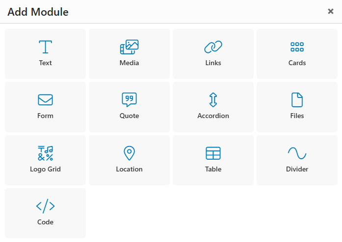
Most pages on your website will be built using a modular, drag-and-drop page builder that requires no coding knowledge. These flexible content modules make it easy to create engaging page layouts and are similar to tools many users are already familiar with.
While final module selections will be built during development, reviewing the available modules now can help spark ideas for how to organize and present your content.
Explore the module list below and start thinking about how you’d like to structure your site.
Text Module
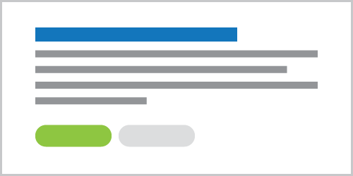
The basic text module includes a headline, body text, and buttons.
Text Module with Video
The Text module also supports adding an image or video on either side of the text or, in some cases, as a background (image only).

Text Module with Image
You can select the media position (left or right) and its size. This module is perfect for creating a balanced focal point on your webpage!
Media Module
- Image: A module that highlights a single image as the main focal point. The image can be resized or displayed as a lightbox, opening in an overlay for clearer viewing.
- Gallery: A grid-based image gallery offering various styles, including square or landscape cropping, adjustable image spacing, and flush layouts. Images can also be viewed in a lightbox.
- Video: A module for embedding videos from popular platforms like YouTube or Vimeo directly onto your website.
Gallery
Video
Form Module
The Form Module lets you add a customizable form directly to your website, with flexible sizing, placement, and optional supporting content. It’s fully responsive and ADA compliant, and includes built-in confirmation messages, automated user emails, and admin notifications for every submission.
You can also add contact info in this module, such as address, hours, phone number, and more.
- Address
- Hours
8:00 AM - 5:00 PM
Cards Module
Our most versatile module, the Card Module displays content in easy-to-digest sections that can include text, links, images, or icons. Cards can be arranged in a grid or slider and customized in a variety of sizes and layouts, making this module a flexible option for showcasing content throughout your site.
Cards with Icons
This example below, and the card size is set to Medium, which displays 4 cards in a row on desktop.
Cards with Large Text
This example below, and the card size is set to Extra Large, which displays 2 cards in a row on desktop.
Link Grid Module
A module housing a grid of links that feature images or icons. If you have a landing page that directs to multiple different high value pages on the site, this could be an optimal way to direct user flow!
Logo Grid Module
Similar to gallery earlier, this grid is specific for logos from different companies. You may need to link sponsors or partners on certain pages in a clean, unobtrusive format.



Quote Module
A module that comes as a single quote from a source, or has the option to be a carousel, sliding through all your testimonies! This comes equipped with an area for text, a name, title, and even an image.

Laurie Ipsum
Company Name
File Module
Sometimes you have many different documents that need to be accessible on your website. Whether that is for internal use, or trying to get your annual report to your end user, this module has you covered. It automatically detects the size, and type of document and uses an icon, and text to show the user what they are interacting with.
Location Module
This module ensures users know where your locations are, helping filter leads to drive the right conversions. It includes a location image, descriptive text, and optional fields for hours, contact information, such as email and phone.
Accordion Module
This module is perfect for reducing page length and avoiding information overload. Ideal for FAQ pages, it keeps content clean and organized by displaying only what the user wants to see, revealing answers only when clicked.
Lorem ipsum dolor sit amet, consectetur adipiscing elit. Sed vulputate at neque eget ullamcorper. Suspendisse molestie est eget facilisis finibus. Praesent rhoncus, nunc quis dapibus laoreet, diam est aliquet nibh, id semper leo turpis eget nulla. Proin sem odio, pellentesque a justo ac, eleifend egestas massa. In rutrum nulla id fringilla venenatis.
Praesent blandit aliquet volutpat. Cras placerat sapien lorem, vitae congue eros ullamcorper quis. Curabitur imperdiet urna scelerisque, vehicula velit nec, cursus metus. Ut tincidunt dapibus dui, sed luctus lorem rhoncus at. Proin non faucibus est. In non scelerisque dolor, quis ultrices quam.
Duis a lacus leo. Suspendisse egestas, quam eu condimentum volutpat, erat massa commodo urna, vitae vehicula ante purus a metus.
Post Feed Module
This module lets you display blog content on other pages of your site. You can choose to automatically show the three most recent posts, or manually select specific posts to feature.



Table Module
A module that features a top level and multiple rows and columns to keep your data, or information neat and clean. Table is exceptional at comparing and contrasting data without putting the comparison work on the user.
| Stub Column | Column A | Column B |
|---|---|---|
| Lorem ipsum 1 | dolor sit amet, consectetur adipiscing elit | 364% |
| Lorem ipsum 2 | eu convallis neque dictum eget | $802 |
| Lorem ipsum 3 | Fusce dolor dolor | 23 |
Modules with Images
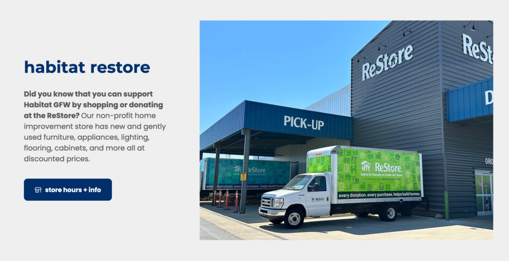
Some modules incorporate images, and in certain cases, images may be required. Images are an excellent way to visually enhance your page and improve its overall look and readability.
Modules with Icons
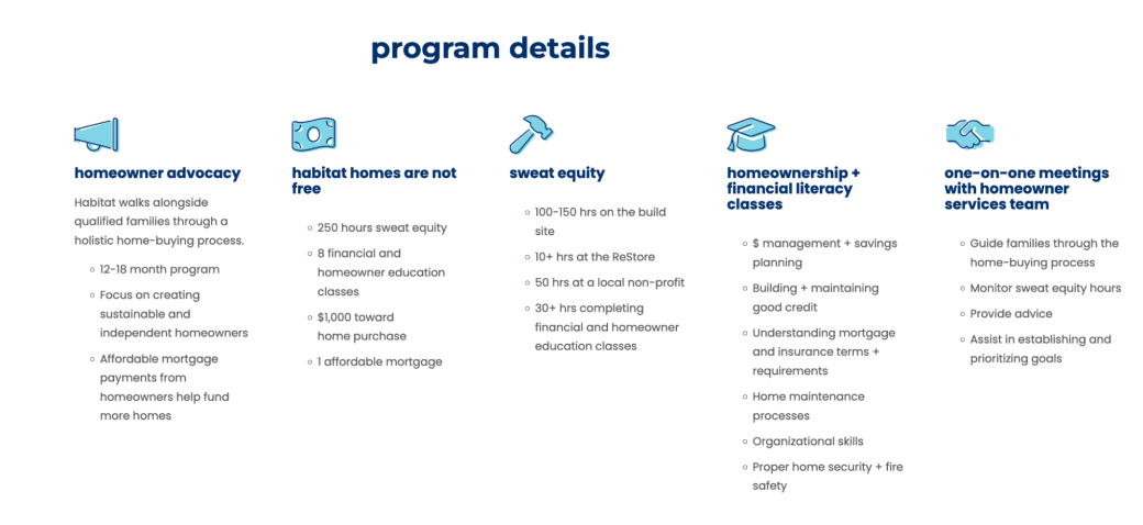
Like images, icons can be added to certain modules, providing a quick visual cue for specific sections. For example, in a services section covering multiple areas, using icons on cards helps users quickly grasp the content. The example on the left demonstrates optimal use of icons alongside text.
Modules with Color
With the flexibility of the site’s modules, color options play an important role. Asher will provide multiple branded, accessibility-compliant color schemes for each module, allowing you to adjust backgrounds and visual elements to better highlight content and separate sections throughout the page.
Notice how this page has used different background colors to keep different thoughts/topics separate.